And about me……
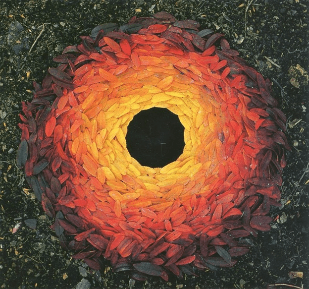
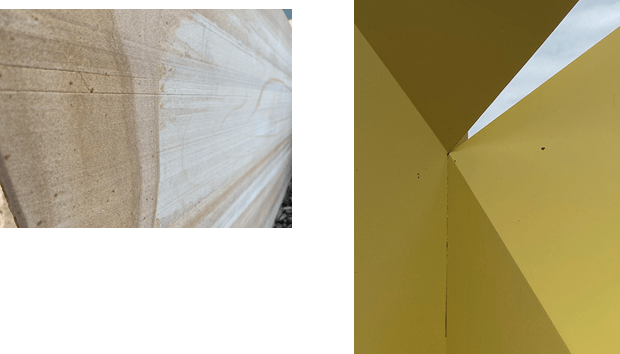
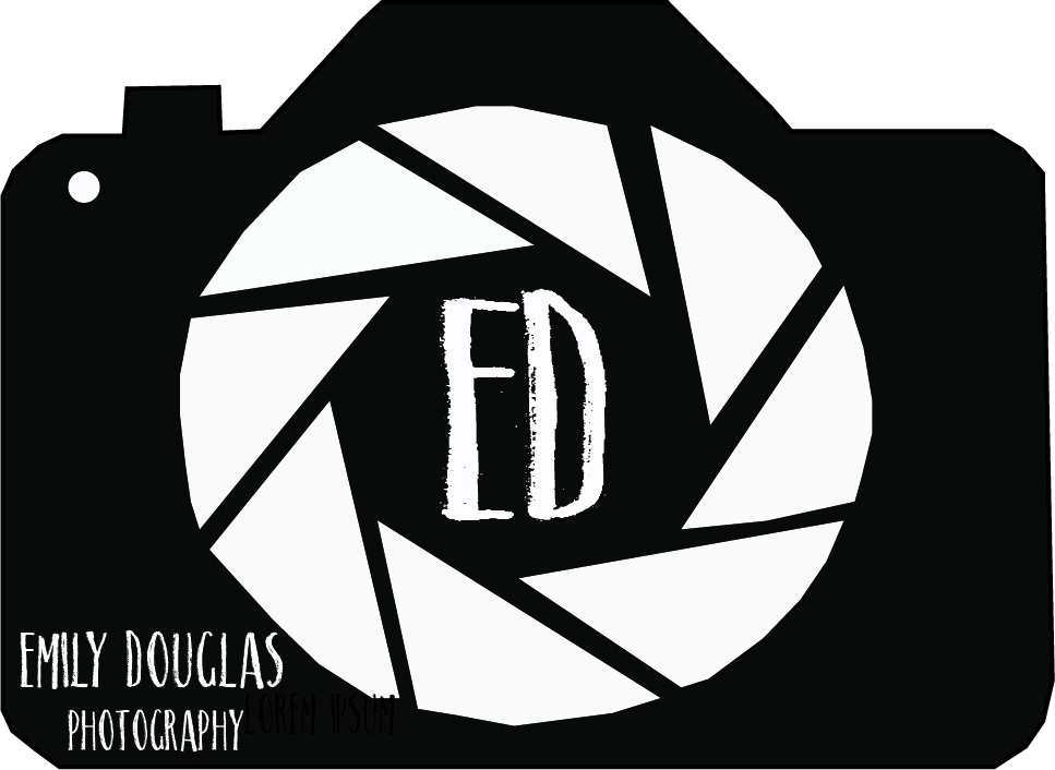
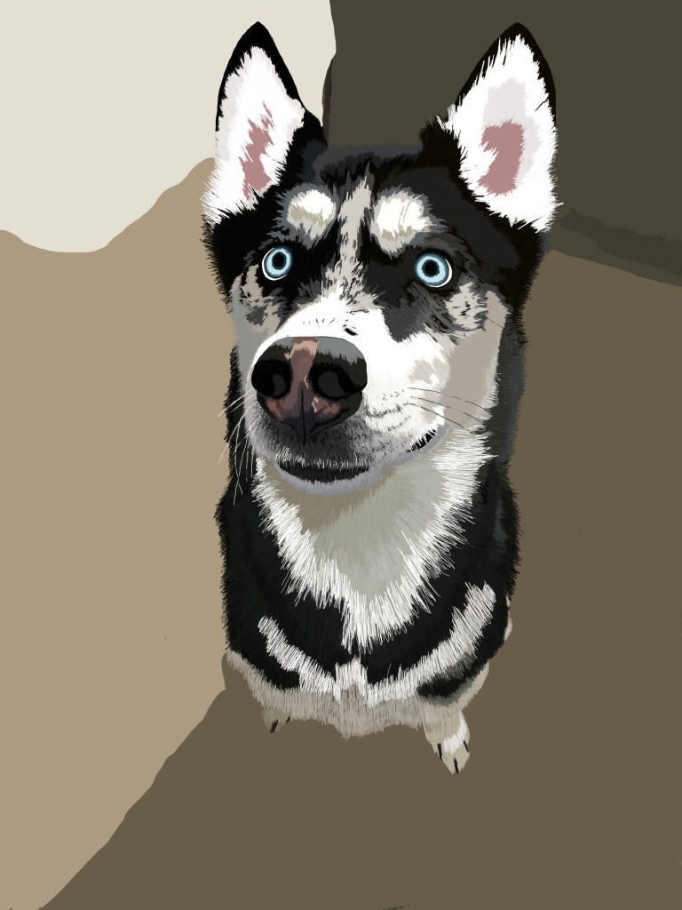
My name is Kellie Erickson and I’m a senior with a major in art, minoring in digital media. My artistic focus through most of my time at Metro State has been on painting, so that means I’m still a novice at Graphic Design (and at WordPress.) I started out painting nature scenes in oil, but over the years have progressed to creating works in abstract expressionism. The close up above is of abstract environmental assemblage I did for a senior project this fall. I’ve always been facinated with typography and how it can add power and emotion to words, so I’m looking forward to this quarter.
Getting the point about points……
Point: Even though points are normally small and without mass, I liked the big point at the center of this Andy Goldsworthy environmental assemblage. This point is defined not so much by its definitive shape but also the surrounding elements. And each concentric color in this work becomes its own point. To paraphrase Lupton and Phillps in the New Basics book, these points “make their own identities.”
Getting a line on lines……
Line: There are lots of lines in this photo. Horizontal, vertical and there are lines between the lines in the water and the sand. It’s good representation of lines created by the “negative gap.” Those lines in the foreground, with different sizes and angles, lead you out towards the ocean. And the lines in the ocean define planes, which then leads to the lines in the sky. While not a graphic, it’s a good example that lines and planes constantly appear in the natural environment.

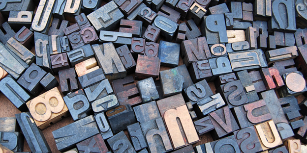
Look, it’s a plane!
Plane: You can find a lot of planes in this photo. Not only do you have the flat plane represented by the horizontal surface of each of the wood letterpress blocks, but each block has a number of edges that form vertical planes across the photo. And the different lines in each of the letters give you event more planes, giving the impression of depth and form on multiple physical planes.
But Wait! There’s More!
I went looking for more points, lines and planes…..here’s what I found:
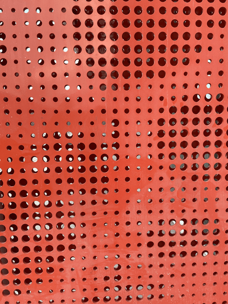
Points in Points…..I thought this was a great example of points as they can be different sizes, on any plane (the points can been seen through the other side) and what I liked the best is shows there can be points within a point. And since the points are in rows, they’re forming lines. All three elements are going on in the same photo.
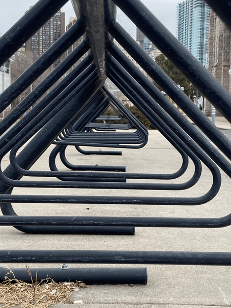
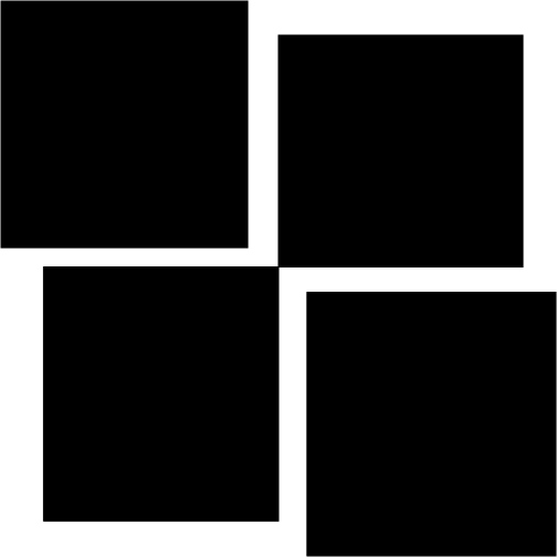
The Plane is Plain: This bike rack is a good example of a multiple levels of planes as each of the repeating shapes is represented on a different level on a visual plane. Even though this is a two-dimensional photo, the repetition of smaller and smaller shapes on each plane gives the work both depth and a sense of volume. And the planes here are lines that all start from a point. Again all three in the same photo.
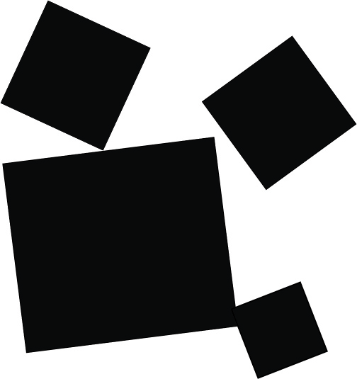
On Line…….Both of these pictures below show a good examples of lines and how they give connection and direction between points. The photo on the right shows the tranisiton where a line becomes thick enough that evolves into a plane. And on the left, when the lines all come together, there’s a point. Which then becomes the start of a number of planes extending outwards. So the lesson here is that line, point and plane are all interconnected and interdependent when it comes to graphic design.
Exercise 2
Bold

Get new content delivered directly to your inbox.

Thinking about Rhythm, Balance and Scale
They are right about the human need for balance – am always straightening picture frames and rearranging things improve visual balance. It almost gets in the way. When starting on a painting, I spend a sketching and re-sketch looking for the right composition. I have no trouble working with either a symmetrical or asymmetrical design to get it right, but getting the rhythm right is harder, for some reason. It may be because if something is out of rhythm, it is so easy to spot, but correcting it is hard. If you look at my photo at the top of my blog, I think the rhythm of the horizontal post is wrong. When you add the concept of pacing (which strikes me as similar to asymmetry) it seems even more difficult to define what looks good. Thankfully, I’m pretty comfortable about scale and it’s fascinating when the concept is applied to type. Scaling the size up and down in both the horizontal and vertical can totally change the meaning and emotion of the message being delivered.
Eames Design
Charles Eames explaining what is design in his eyes was an interesting and I thought the outline of the Question lined up with the answer was a cool viewpoint. I also liked on how his answers were straightforward but also had meaning.
Norman Potter
The section from this book describes the function of a designer, it’s a good angle to think about how influential designers have throughout the whole process and different ways to look at each step.
Texture, Color and Gestalt
I really like the dual nature of texture – it’s both visual and tactile at the same time. And something that appears to be rough can be smooth. And vice versa . Like scale, I think that virtual texture can add emotion and impact to a message or a design. I really like the way they showed that in the book with Anna Esheiman’s Five Squares Ten Inches work, showing how scale of type can simulate the appearance of texture.
The section on color theory is very similar to what I’ve been taught in my painting classes, but I found the differences between RGB and CYMK really interesting. I had never thought about how colors are reproduced on either paper or on a screen. With painting, you put the color on and you’re done.
The concept of figure/ground tension is also new to me. I understood negative spaces in composition, but until I saw some the of the examples in the book (like the alphabet made by holding white cards over a dark background) did I see how the much power this can have in a design.
The Monet Event – I Liked the Paintings but not the Exhibit
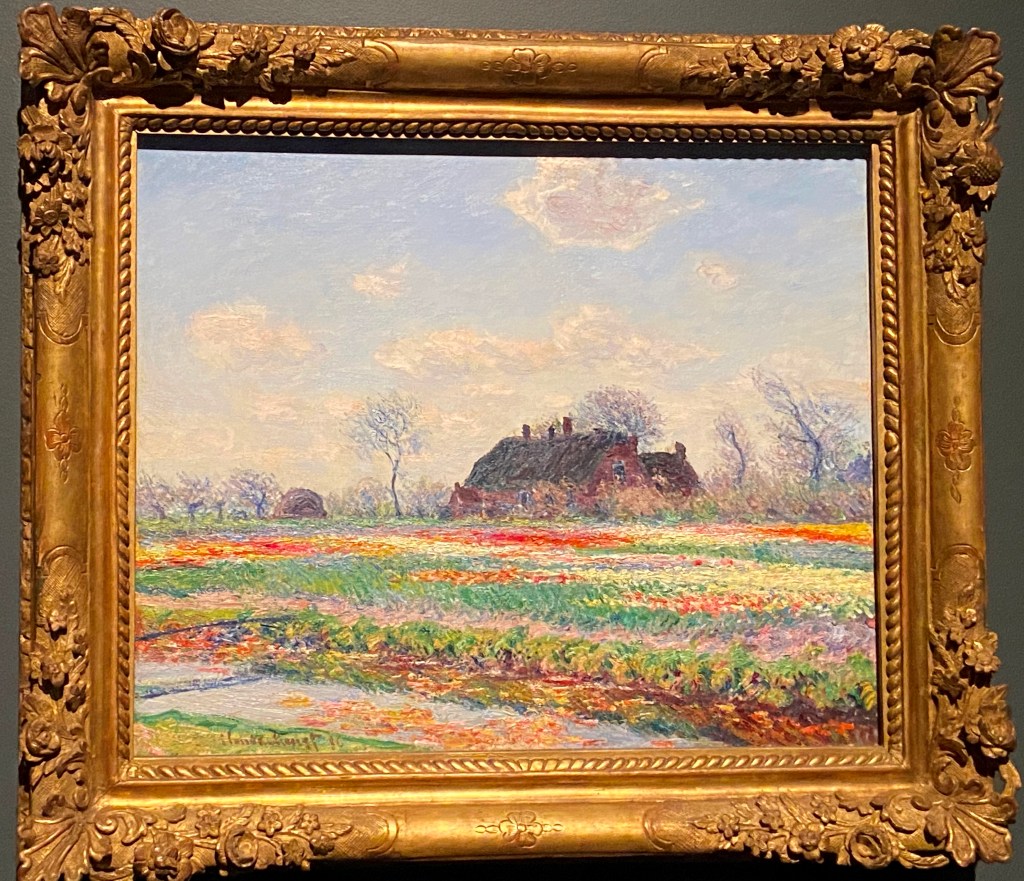
Just before it closed in early February, I went to the Claude Monet exhibit titled “The Truth of Nature” at the Denver Art Museum. With 124 paintings from 80 collections it was a pretty impressive show and it’s easy to see why he is considered one of the great impressionists. I had seen his paintings for years in art books but the reproductions never showed the detail and subtle colors of his canvases. One of the things that that was so amazing was to see up close his brush technique and the ability to capture the essence of flower or a leaf with what seemed to be a simple brush stroke. An example of this is his 1886 work Tulip Fields at Sassenheim, (below) where each flower, tree or cloud is a small slash of color that combined make for a classic Impressionistic painting.
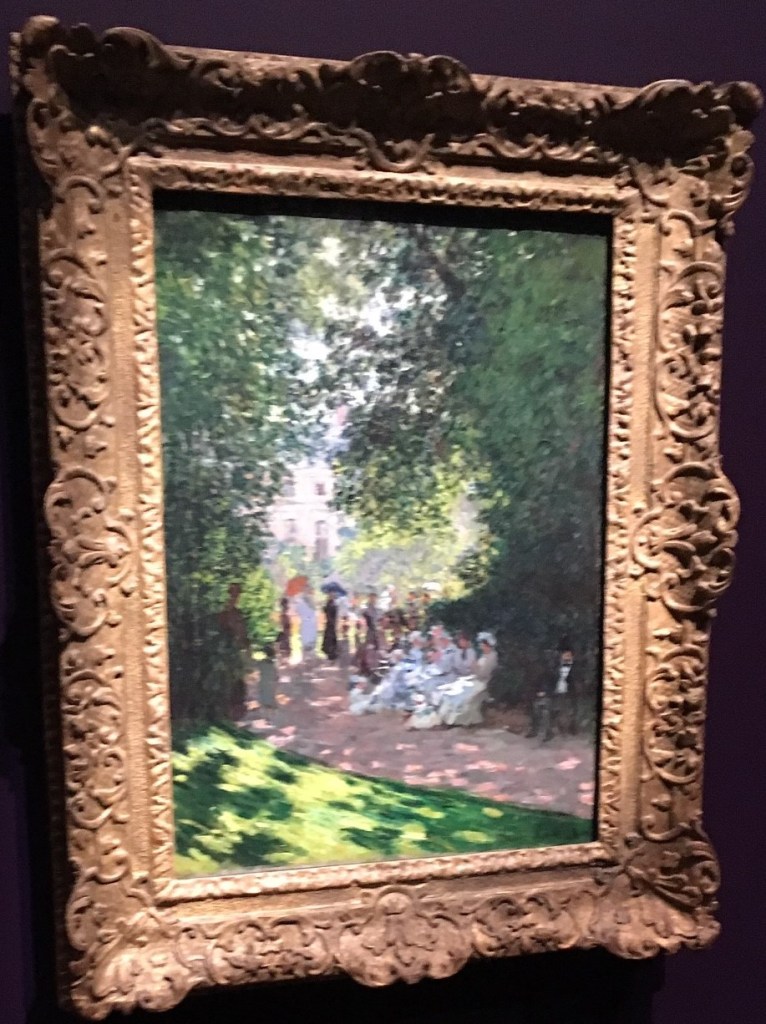
His ability to capture the light of a scene was striking. The way he painted the sunlight on the grass and the people in the shadows make his 1878 The Parc Monceau on of my favorites of the exhibition (below).
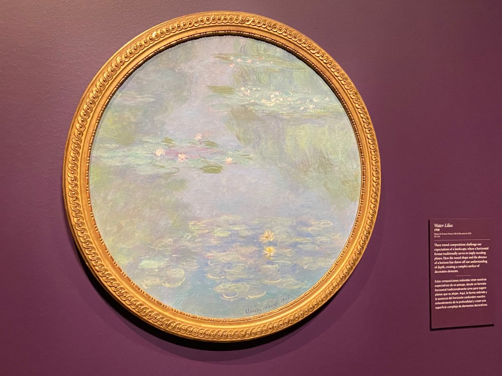
While the paintings covering his entire career from 1851 to 1826, it stuck me there were almost too many of them. The focus of the show was on his landscapes and the works seemed to get repetitive as you walked through the gallery. This was particularly true in the paintings in his later years where he began painting the same scene over and over again. While some of the many paintings of water lilies he did late in life were compelling, many just seemed to be ordinary variations on a theme as shown below.
With the popularity of Monet, I wasn’t surprised that the show was really crowded, even on a Wednesday afternoon. Moving at your own pace was difficult as you were pushed along by all the mass of people, making it hard to appreciate individual works. The presence of guards and “do not cross” boundaries painted on the floor in front of every painting detracted from the experience. And of course you exited though the gift shop where you could get a reproduction of your favorite Monet on just about any household object.
While I really enjoyed seeing these paintings and getting closer look at the life of one of the great artists, I was also struck that the exhibit was somewhat of an more of an effort of the Denver Art Museum to gain publicity, donations and revenue rather than taking a critical look at an important artist. I felt like the museum was trying to make Monet into a pop star and cash in on the crowds.
Exercise 4 Self Portrait
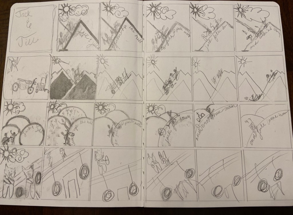
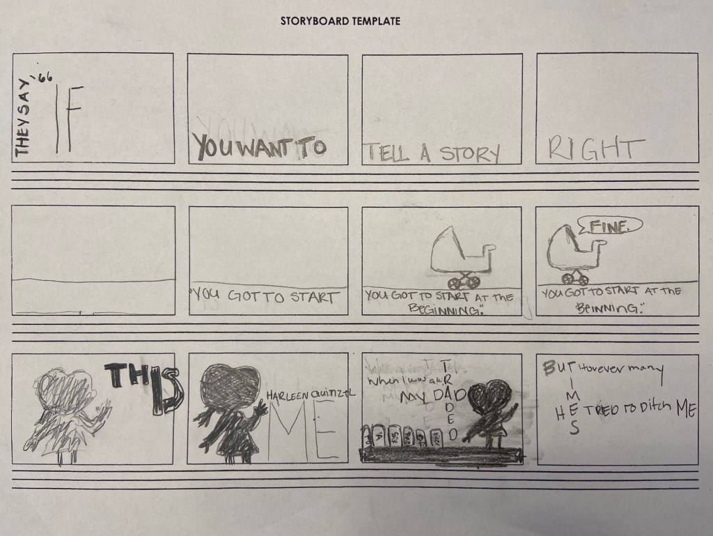
Project 4 Storyboard Sketches
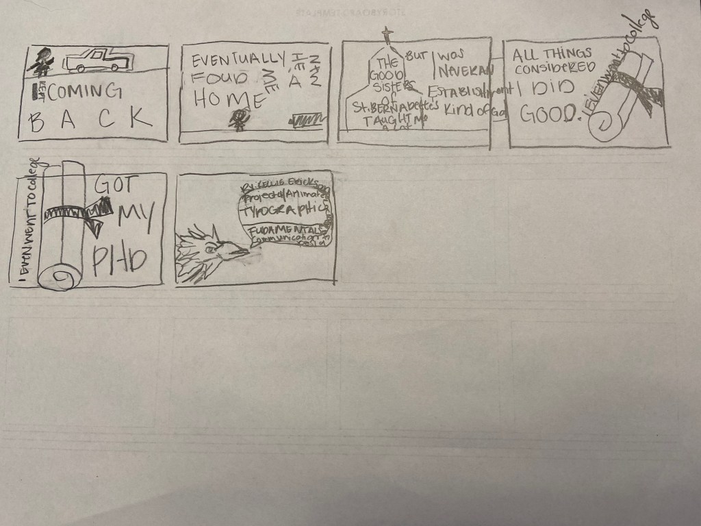
The Typefaces I used was punishment and Proxima for my typefaces in the video.
